A new look
Posted by 32th System on
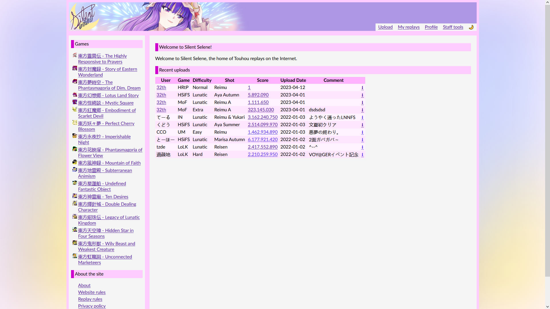
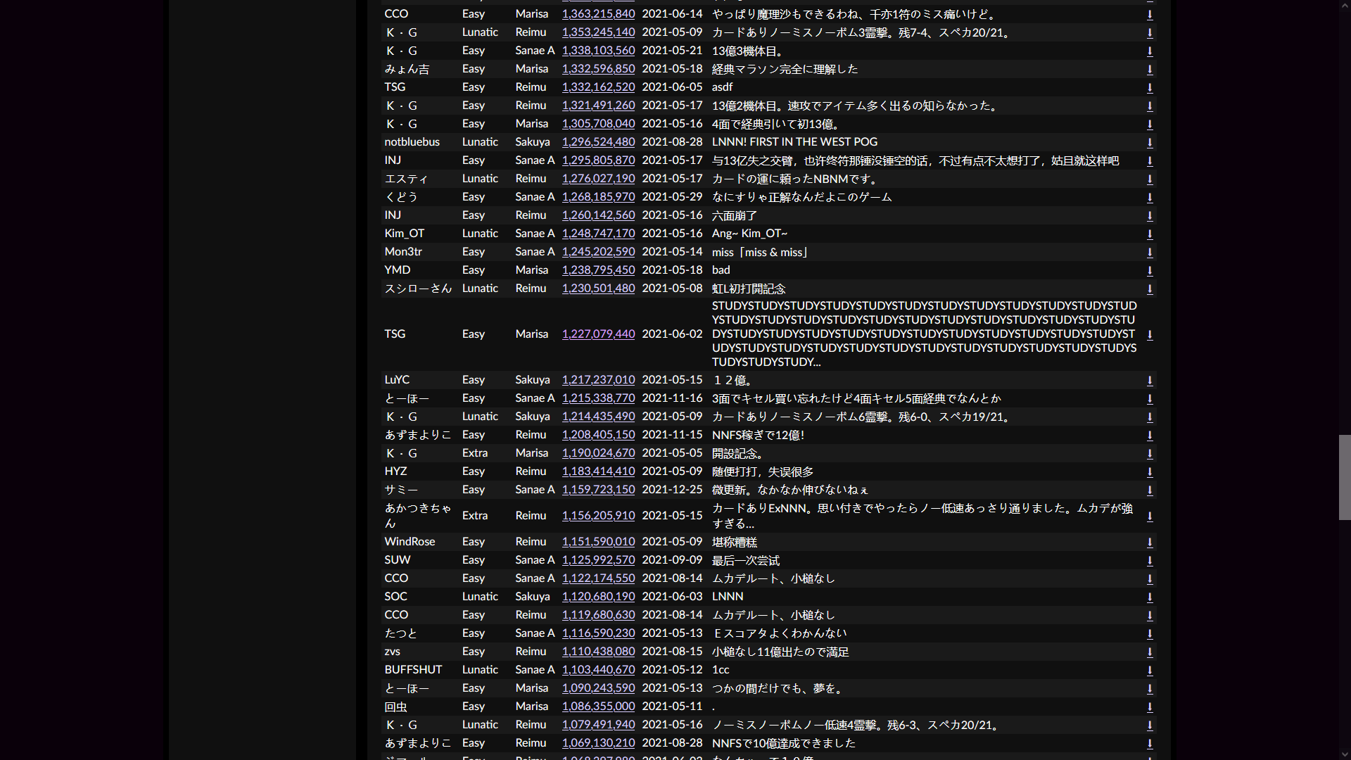
Silent Selene has a new look!
For as long as we can remember, Silent Selene was nothing but placeholders. Technically functional, but not pretty. Well no more; the new look is here!
First, there is the new icon and banner. These were both drawn by Addamelech. We reached out to him specifically not just because he's a great artist, but also because he hangs around the competitive Touhou community (meaning he was really easy to get a hold of). We requested these to be Patchouli themed, obviously. The site's name is Silent Selene which is just the Patchouli spell that comes before Royal Flare. Also our website is library of sorts and is also using a purple-magenta color sceme similair to Patchouli herself.


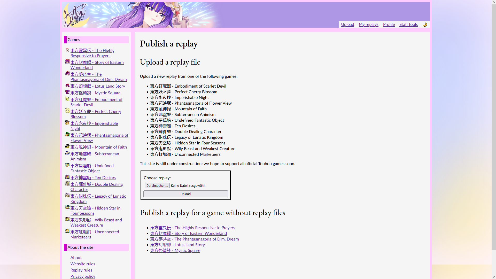
And this is what they look like. But now onto the big news:


Originally developed by Nylilsa, the idea behind the new design was (obviously) to look better than our old one. As for the style and design language (not really sure what to call it), we wanted an old school looking look similair to old Royalflare or KG's website (which admittedly has a much closer resemblance to our website than old Royalflare). Oh and I guess the old website (circa 2006) of The University of Texas Medical School at Houston which was also used as a reference?
Note that only the basic site layout and naviation was redesigned. A lot of pages from the original site were put into the new layout without much further editing. Look no further than the replay upload pages, or the replay details pages. We do want to redesign those as well, but for now, they remain as is.


This core design will likely not change again, maybe ever. But, we will keep extensing the site, building on top of this new foundation to deliver new features.
(PS: The gradient in the light theme screenshots might not stick around)